Wednesday, December 28, 2011
San Francisco Condo Kitchen
This kitchen will be under construction Spring 2011. I am very excited for this great family to finally have a functional space! The previous kitchen was without an oven and housed an over-sized fridge. The new kitchen incorporates responsibly forested wood cabinetry in contrasting colors, Vertrazzo counters (a recycled material fabricated less then an hour from the residence), a glass back-splash and cork flooring. The style and materials keeps up with the homeowners' flare for modern and eco-friendly materials and yet is resilient.
Friday, December 16, 2011
Color Temperature
How do you want your room to feel? Perhaps if more hotels offered rooms to play to more of our senses, patrons would be more apt to return. If more hotels offered color choices during the reservation or at check-in, people would enjoy their stay all the more. Color makes people feel hot or cold-truly. In warmer climates, whites and linens helps us to feel cooler. In colder climates, warm color gets our blood flowing and we feel warmer. So, if you're a business man from CA visiting NYC in the dead of winter, perhaps the cool modern room would be too cold. This business man maybe more inclined to chose a warmer room. All this temperature change and no need to adjust the thermostat. Our bodies do it naturally for us.
Color preferences also have to do with personality and where we grew up. Blue, in some cultures, is a depressing or freighting color; while in other cultures, the color blue is calming.
Watercolors by Ida York
Thursday, December 15, 2011
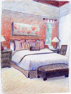
Master Suite
There is a psychology to color. A simple explanation of red would be passion and pink is used for romance. There are ways to achieve romance and passion without using icons or drenching the room in paint. Instead, create a nest. Add in color from the red family and something from nature. In this case, I used flowers to help convey the idea of love and tie in the romantic colors. The sketches above are in graphite and color pencil.
Living Room Sketch
In the sketch above, I used only graphite. Sometimes before fabrics have been selected I like to provide a sketch or drawing to show the direction I am heading.
Tuesday, December 13, 2011
Oval Office
With every new U.S. president the white house undergoes a new interior design. This is not what the oval office looks like, but it could! This rendering measures approximately 18"x24". Watercolor rendering by Ida York, perspective drawing by Stephan Hoffpauir.
San Francisco Green House
Many home owners opt for renderings. It's a great tool for designers. I always render for my clients. As an added bonus to myself, rendering relaxes me. Above is a color pencil rendering of a house in San Francisco that I have affectionately named "the green house." Rendering by Ida York, perspective drawing by Stephan Hoffpauir.
Subscribe to:
Comments (Atom)


